自定义你的主题方案
1. 示例介绍
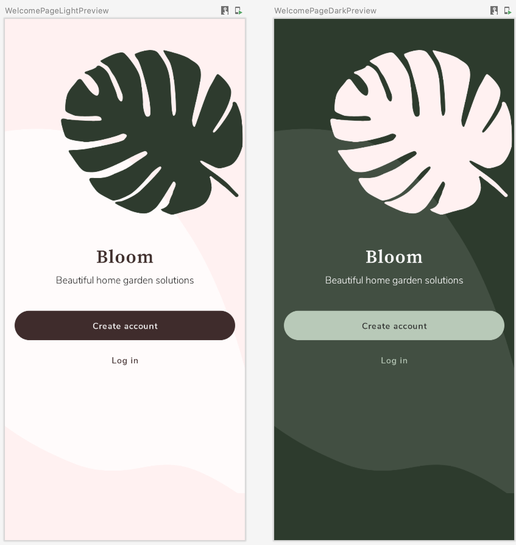
通过阅读前两篇文章相信你已经具备自定义主题方案的能力了。我们通过#AndroidDevChallange挑战赛第三周题目作为示例来看看在实际项目中如何进行应用。在不同主题方案下背景颜色、文字颜色与图片资源都是不同的。值得注意的是对于所有文本也可以通过主题完成字体样式的配置,所要实现的目标效果如下图所示。
2. 配置颜色样式
首先,我们来学习如何配置颜色样式。其实这里的内容在初识MaterialTheme章节中的操作是一样的。我们仅需要根据主题的不同生成其对应的colors即可。根据项目需求,我们进行以下的配置。
private val BloomLightColorPaltte = lightColors(
    primary = pink100,
    secondary = pink900,
    background = white,
    surface = white850,
    onPrimary = gray,
    onSecondary = white,
    onBackground = gray,
    onSurface = gray,
)

private val BloomDarkColorPaltte = darkColors(
    primary = green900,
    secondary = green300,
    background = gray,
    surface = white150,
    onPrimary = white,
    onSecondary = gray,
    onBackground = white,
    onSurface = white850
)

@Composable
fun BloomTheme(theme: BloomTheme = BloomTheme.LIGHT, content: @Composable() () -> Unit) {
    CompositionLocalProvider(
        LocalWelcomeAssets provides if (theme == BloomTheme.DARK) WelcomeAssets.DarkWelcomeAssets else WelcomeAssets.LightWelcomeAssets,
    ) {
        MaterialTheme(
            colors = if (theme == BloomTheme.DARK) BloomDarkColorPaltte else BloomLightColorPaltte,
            typography = Typography,
            shapes = shapes,
            content = content
        )
    }
}
在我们的视图所需要Color的地方配置即可。
Text(
    text = "Beautiful home garden solutions",
    textAlign = TextAlign.Center,
    color = MaterialTheme.colors.onPrimary // I'm here
)
3. 配置字体样式
我们接着来学习如何配置字体样式。还记得MaterialTheme方法嘛,其实第二个参数typography表示的就是你所配置的字体,只是这个Typography是Android Studio默认帮你配制的。
MaterialTheme(
    colors = colors,
    typography = Typography,
    shapes = Shapes,
    content = content
)
如果是新建的项目,Android Studio会在ui.theme包下生成Type.kt,其中包含了Typography的实现,名为Typography的变量间接调用Typography类构造函数。
val Typography = Typography(
    body1 = TextStyle(
        fontFamily = FontFamily.Default,
        fontWeight = FontWeight.Normal,
        fontSize = 16.sp
    )
)
再回到MaterialTheme实现,可以发现typography提供给LocalTypography这个CompositionLocal实例了,那么我们在项目中如何使用这个特殊字体也不需要额外的介绍了,这与colors是完全一样的。
@Composable
fun MaterialTheme(
    colors: Colors = MaterialTheme.colors,
    typography: Typography = MaterialTheme.typography,
    shapes: Shapes = MaterialTheme.shapes,
    content: @Composable () -> Unit
) {
    val rememberedColors = remember {
        colors.copy()
    }.apply { updateColorsFrom(colors) }
    val rippleIndication = rememberRipple()
    val selectionColors = rememberTextSelectionColors(rememberedColors)
    CompositionLocalProvider(
        LocalColors provides rememberedColors,
        LocalContentAlpha provides ContentAlpha.high,
        LocalIndication provides rippleIndication,
        LocalRippleTheme provides MaterialRippleTheme,
        LocalShapes provides shapes,
        LocalTextSelectionColors provides selectionColors,
        LocalTypography provides typography // I'm here~
    ) {
        ProvideTextStyle(value = typography.body1, content = content)
    }
}
既然懂得了原理,我们仅需要根据项目实际需求配置字体样式即可,既然Android Studio帮助生成Type.kt,说明是官方希望我们将字体样式配置在这个文件中的。这是一种规范,但也可不遵守。
值得注意的是由于每种字体都会有不同的粗细风格,我们在字体样式配置时需要指明字体种类与粗细风格。
val nunitoSansFamily = FontFamily(
    Font(R.font.nunitosans_light, FontWeight.Light),
    Font(R.font.nunitosans_semibold, FontWeight.SemiBold),
    Font(R.font.nunitosans_bold, FontWeight.Bold)
)
val bloomTypography = Typography(
    h1 = TextStyle(
        fontSize = 18.sp,
        fontFamily = nunitoSansFamily,
        fontWeight = FontWeight.Bold
    ),
    h2 = TextStyle(
        fontSize = 14.sp,
        letterSpacing = 0.15.sp,
        fontFamily = nunitoSansFamily,
        fontWeight = FontWeight.Bold
    ),
    ....
)
使用的话就很简单了,我们仅需将字体样式传入MaterialTheme即可。
@Composable
fun BloomTheme(theme: BloomTheme = BloomTheme.LIGHT, content: @Composable() () -> Unit) {
    MaterialTheme(
         colors = if (theme == BloomTheme.DARK) BloomDarkColorPaltte else BloomLightColorPaltte,
         typography = bloomTypoGraphy,
         shapes = shapes,
         content = content
    )
}
在我们的视图组件中使用style参数进行配置即可。
Text(
    text = "Beautiful home garden solutions",
    textAlign = TextAlign.Center,
    style = MaterialTheme.typography.subtitle1, // I'm here
    color = MaterialTheme.colors.onPrimary
)
4. 配置自定义资源
有时我们可能需要根据主题的不同使用不同的多媒体资源,例如图片、视频、音频等等。通过查阅MaterialTheme参数列表我们没有发现可以进行配置的参数。难道 Jetpack Compose 不具备这样的能力?答案当然是否定的,Android团队已经充分考虑了各种场景,只是针对于这种需求而言,我们需要进行额外的定制扩展。
在前一篇文章中,我们已经详细介绍了MaterialTheme工作原理,想必你也猜到了,就是通过定制CompositionLocal方式来实现图片资源的扩展,根据主题的不同选用其对应的多媒体资源。
open class WelcomeAssets private constructor(
    var background: Int,
    var illos: Int,
    var logo: Int
) {
    object LightWelcomeAssets : WelcomeAssets(
        background = R.drawable.ic_light_welcome_bg,
        illos = R.drawable.ic_light_welcome_illos,
        logo = R.drawable.ic_light_logo
    )

    object DarkWelcomeAssets : WelcomeAssets(
        background = R.drawable.ic_dark_welcome_bg,
        illos = R.drawable.ic_dark_welcome_illos,
        logo = R.drawable.ic_dark_logo
    )
}

internal var LocalWelcomeAssets = staticCompositionLocalOf {
    WelcomeAssets.LightWelcomeAssets as WelcomeAssets
}
于此同时,我们还希望能够在视图中仍通过MaterialTheme来访问我们的图片资源,那么则可以通过Kotlin扩展属性的特性进行实现(扩展属性是没有幕后字段的,只能委托其他实例)。值得注意的是,CompositionLocal只能在composable(带有Composable注解的lambda)中使用,所以我们需要为这个属性获取添加@Composable与@ReadOnlyComposable注解。
val MaterialTheme.welcomeAssets
    @Composable
    @ReadOnlyComposable
    get() = LocalWelcomeAssets.current
这样我们在视图中就可以仍然通过MaterialTheme来获取扩展的图片资源了。
Image(
     painter = rememberVectorPainter(image = ImageVector.vectorResource(id = MaterialTheme.welcomeAssets.background)),
     contentDescription = "weclome_bg",
     modifier = Modifier.fillMaxSize()
)
既然了解了图片的主题配置,其他多媒体资源的主题配置是完全相同的,请充分发挥你的想象力。