BottomNavigation
@Composable
fun BottomNavigation(
    modifier: Modifier = Modifier,
    backgroundColor: Color = MaterialTheme.colors.primarySurface,
    contentColor: Color = contentColorFor(backgroundColor),
    elevation: Dp = BottomNavigationDefaults.Elevation,
    content: RowScope.() -> Unit
): @Composable Unit
Material Design bottom navigation
Bottom navigation bars 允许在一个应用程序的主要目的地之间移动。
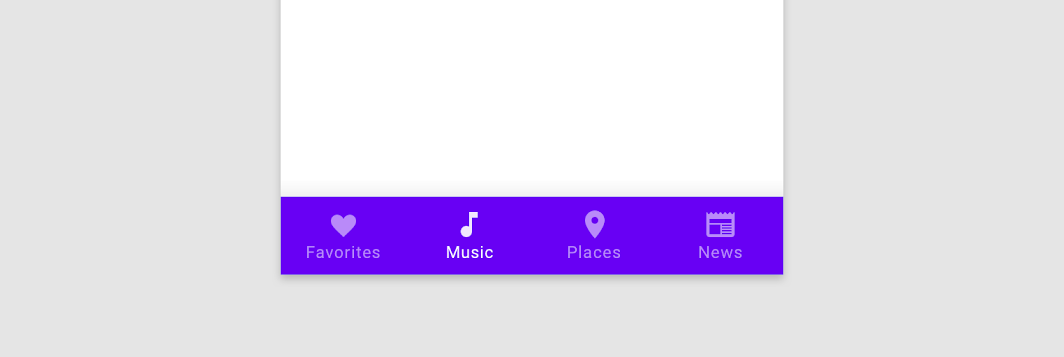
BottomNavigation 应该包含多个 BottomNavigationItems 项,每个导航项代表一个单一的目的地。
这是一个简单和 Scaffold 搭配的示例代码:
@Composable
fun ScaffoldDemo(){
    var selectedItem by remember { mutableStateOf(0) }
    val items = listOf("主页", "我喜欢的", "设置")
    Scaffold(
        topBar = {
            TopAppBar(
                title = {
                    Text("主页")
                },
                navigationIcon = {
                    IconButton(onClick = {

                    }) {
                        Icon(Icons.Filled.ArrowBack, null)
                    }
                }
            )
        },
        bottomBar = {
            BottomNavigation {
                items.forEachIndexed { index, item ->
                    BottomNavigationItem(
                        icon = { Icon(Icons.Filled.Favorite, contentDescription = null) },
                        label = { Text(item) },
                        selected = selectedItem == index,
                        onClick = { selectedItem = index }
                    )
                }
            }
        }
    ){

    }
}
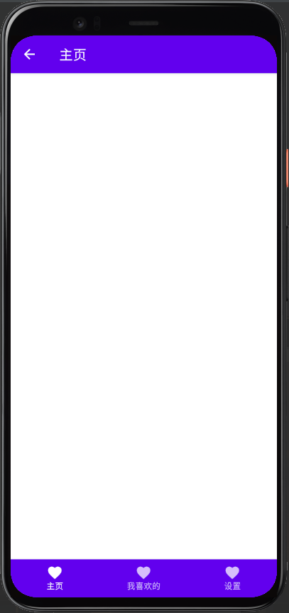
这样一个基本的底部导航栏我们就实现啦。
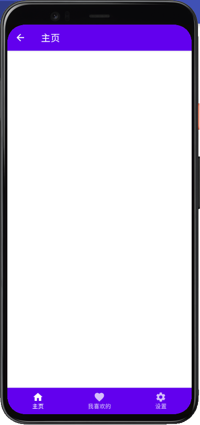
我们可以稍微修改一点代码,让导航栏变成三个不同的图标按钮
将 BottomNavigationItem 的代码修改成以下
BottomNavigationItem(
    icon = {
        when(index){
            0 -> Icon(Icons.Filled.Home, contentDescription = null)
            1 -> Icon(Icons.Filled.Favorite, contentDescription = null)
            else -> Icon(Icons.Filled.Settings, contentDescription = null)
        }
    },
    label = { Text(item) },
    selected = selectedItem == index,
    onClick = { selectedItem = index }
)
自定义 BottomNavigation 栏
这是一个自定义 BottomNavigation 栏的演示
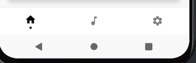
实现的代码可以通过以下的方式来查看