Alertdialog
@Composable
fun AlertDialog(
    onDismissRequest: () -> Unit,
    confirmButton: () -> Unit,
    modifier: Modifier = Modifier,
    dismissButton: () -> Unit = null,
    title: () -> Unit = null,
    text: () -> Unit = null,
    shape: Shape = MaterialTheme.shapes.medium,
    backgroundColor: Color = MaterialTheme.colors.surface,
    contentColor: Color = contentColorFor(backgroundColor),
    properties: DialogProperties = DialogProperties()
): @Composable Unit
1. 简单使用
val openDialog = remember { mutableStateOf(true) }
if (openDialog.value) {
AlertDialog(
onDismissRequest = {
// 当用户点击对话框以外的地方或者按下系统返回键将会执行的代码
openDialog.value = false
},
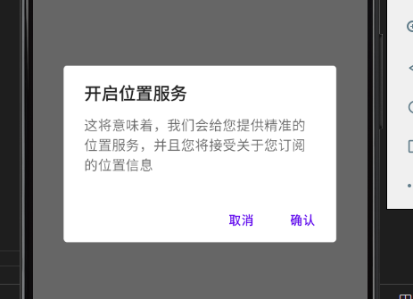
title = {
Text(
text = "开启位置服务",
fontWeight = FontWeight.W700,
style = MaterialTheme.typography.h6
)
},
text = {
Text(
text = "这将意味着,我们会给您提供精准的位置服务,并且您将接受关于您订阅的位置信息",
fontSize = 16.sp
)
},
confirmButton = {
TextButton(
onClick = {
openDialog.value = false
},
) {
Text(
"确认",
fontWeight = FontWeight.W700,
style = MaterialTheme.typography.button
)
}
},
dismissButton = {
TextButton(
onClick = {
openDialog.value = false
}
) {
Text(
"取消",
fontWeight = FontWeight.W700,
style = MaterialTheme.typography.button
)
}
}
)
}
如果一切顺利,运行程序,您将会看到:
AlertDialog 将根据可用空间来定位其按钮。默认情况下,它将尝试将它们水平地放在彼此的旁边,如果没有足够的空间,则退回到水平放置。还有另一个版本的 Composable,它有一个按钮槽,可以提供自定义的按钮布局
@Composable
fun AlertDialog(
    onDismissRequest: () -> Unit,
    buttons: () -> Unit,
    modifier: Modifier = Modifier,
    title: () -> Unit = null,
    text: () -> Unit = null,
    shape: Shape = MaterialTheme.shapes.medium,
    backgroundColor: Color = MaterialTheme.colors.surface,
    contentColor: Color = contentColorFor(backgroundColor),
    properties: DialogProperties = DialogProperties()
): @Composable Unit
简单的一个实现代码:
val openDialog = remember { mutableStateOf(true) }
if (openDialog.value) {
AlertDialog(
onDismissRequest = {
openDialog.value = false
},
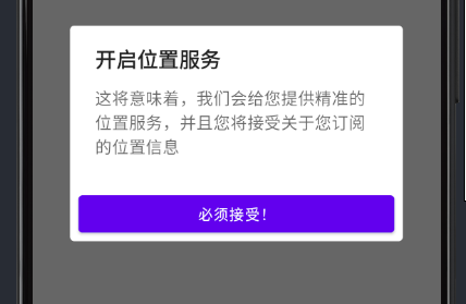
title = {
Text(
text = "开启位置服务",
fontWeight = FontWeight.W700,
style = MaterialTheme.typography.h6
)
},
text = {
Text(
text = "这将意味着,我们会给您提供精准的位置服务,并且您将接受关于您订阅的位置信息",
fontSize = 16.sp
)
},
buttons = {
Row(
modifier = Modifier.padding(all = 8.dp),
horizontalArrangement = Arrangement.Center
) {
Button(
modifier = Modifier.fillMaxWidth(),
onClick = { openDialog.value = false }
) {
Text("必须接受!")
}
}
}
)
}
2. Dialog
AlertDialog 在一些情况下有可能还是无法满足我们的业务要求,这时候我们就可以使用更底层的一个 @Composable 函数 —— Dialog
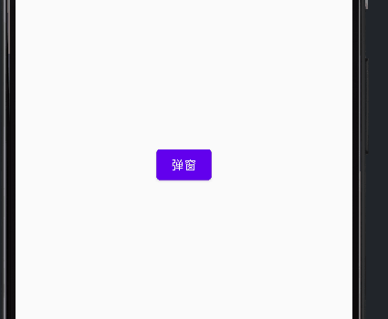
var flag by remember{ mutableStateOf(false) }
Box(
    modifier = Modifier.fillMaxSize(),
    contentAlignment = Alignment.Center
) {
    Button(
        onClick = { flag = true }
    ) {
        Text("弹窗")
    }
}
if(flag) {
    Dialog(
        onDismissRequest = { flag = false }
    ) {
        Box(
            modifier = Modifier
                .size(300.dp)
                .background(Color.White),
            contentAlignment = Alignment.Center
        ) {
            Column {
                LinearProgressIndicator()
                Text("加载中 ing...")
            }
        }
    }
}