Button
1. Button属性
@OptIn(ExperimentalMaterialApi::class)
@Composable
fun Button(
    onClick: () -> Unit,
    modifier: Modifier = Modifier,
    enabled: Boolean = true,
    interactionSource: MutableInteractionSource = remember { MutableInteractionSource() },
    elevation: ButtonElevation? = ButtonDefaults.elevation(),
    shape: Shape = MaterialTheme.shapes.small,
    border: BorderStroke? = null,
    colors: ButtonColors = ButtonDefaults.buttonColors(),
    contentPadding: PaddingValues = ButtonDefaults.ContentPadding,
    content: @Composable RowScope.() -> Unit
)
Compose 的 Button 是基于 Material Design 理念设计的
2. 使用示例
2.1 基本使用
以下是简单创建一个默认的 Button 代码:
import androidx.compose.material.Button
import androidx.compose.material.Text

@Composable
fun ButtonDemo() {
    Button(
        onClick = { /*TODO*/ }
    ) {
        Text("确认")
    }
}
效果如图所示:

也许您想添加图标在文字的旁边,也只需:
@Composable
fun ButtonDemo() {
    Button(onClick = { /*TODO*/ }) {
        Icon(
            // Material 库中的图标,有 Filled, Outlined, Rounded, Sharp, Two Tone 等
            Icons.Filled.Favorite,
            contentDescription = null,
            modifier = Modifier.size(ButtonDefaults.IconSize)
        )
        // 添加间隔
        Spacer(Modifier.size(ButtonDefaults.IconSpacing))
        Text("喜欢")
    }
}

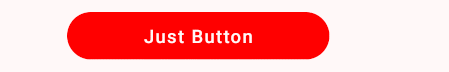
2.2 不同点击状态下的按钮状态
创建 Data class 来记录不同状态下按钮的样式
data class ButtonState(var text: String, var textColor: Color, var buttonColor: Color)
使用 MutableInteractionSource() 获取状态,根据不同状态创建样式
// 获取按钮的状态
val interactionState = remember { MutableInteractionSource() }

// 使用 Kotlin 的解构方法
val (text, textColor, buttonColor) = when {
    interactionState.collectIsPressedAsState().value  -> ButtonState("Just Pressed", Color.Red, Color.Black)
    else -> ButtonState( "Just Button", Color.White, Color.Red)
}
Button 的实现
Button(
    onClick = { /*TODO*/ },
    interactionSource = interactionState,
    elevation = null,
    shape = RoundedCornerShape(50),
    colors = ButtonDefaults.buttonColors(
        backgroundColor = buttonColor,
    ),
    modifier = Modifier.width(IntrinsicSize.Min).height(IntrinsicSize.Min)
) {
    Text(
        text = text, color = textColor
    )
}